What Data Visualization Should Do: Simple Small Truth

Yesterday the good folks at IA Ventures asked me to lead off the discussion of data visualization at their Big Data Conference. I was rather misplaced among the high-profile venture capitalists and technologist in the room, but I welcome any opportunity to wax philosophically about the power and danger of conveying information visually.

I began my talk by referencing the infamous Afghanistan war PowerPoint slide because I believe it is a great example of spectacularly bad visualization, and how good intentions can lead to disastrous result. As it turns out, the war in Afghanistan is actually very complicated. Therefore, by attempting to represent that complex problem in its entirety much more is lost than gained. Sticking with that theme, yesterday I focused on three key things—I think—data visualization should do:

  1. Make complex things simple
  2. Extract small information from large data
  3. Present truth, do not deceive

The emphasis is added to highlight the goal of all data visualization; to present an audience with simple small truth about whatever the data are measuring. To explore these ideas further, I provided a few examples.

As the Afghanistan war slide illustrates, networks are often the most poorly visualized data. This is frequently because those visualizing network data think it is a good idea to include all nodes and edges in the visualization. This, however, is not making a complex thing simple—rather—this is making a complex thing ugly.

Below is an example of exactly this problem. On the left is a relatively small network (V: ~2,220 and E:~4,400) with weighted edges. I have used edge thickness to illustrate weights, and used a basic force-directed algorithm in Gephi to position the nodes. This is a network hairball, and while it is possible to observe some structural properties in this example, many more subtle aspects of the data are lost in the mess.

Slide06.png
Slide07.png

On the right are the same data, but I have used information contained in the data to simplify the visualization. First, I performed a k-core analysis to remove all pendants and pendant chains in the data; an extremely useful technique I have mentioned several times before. Next, I used the weighted in-degree of each node as a color scale for the edges, i.e., the dark the blue the higher the in-degree of the node the edges connect to. Then, I simply dropped the nodes from the visualization entirely. Finally, I added a threshold weight for the edges so that any edges below the threshold are drawn with the lightest blue scale. Using these simple techniques the community structures are much more apparent; and more importantly, the means by which those communities are related are easily identified (note the single central node connecting nearly all communities).

To discuss the importance of extracting small information from large data I used the visualization of the WikiLeaks Afghanistan War Diaries that I worked on this past summer. The original visualization is on the left, and while many people found it useful, its primary weakness is the inability to distinguish among the various attack types represented on the map. It is clear that activity gradually increased in specific areas over time; however, it is entirely unclear what activity was driving that evolution. A better approach is to focus on one attack type and attempt glean information from that single dimension.

Slide08.png
Slide09.png

On the right I have extracted only the 'Explosive Hazard' data from the full set and visualized as before. Now, it is easy to see that the technology of IEDs were a primary force in the war, and as has been observed before, the main highway in Afghanistan significantly restricted the operations of forces.

Finally, to show the danger of data deception I replicated a chart published at the Monkey Cage a few months ago on the sagging job market for political science professors. On the left is my version of the original chart published at the Monkey Cage. At first glance, the decline in available assistant professorships over time is quite alarming. The steep slope conveys a message of general collapse in the job market. This, however, is not representative of the truth.

Slide10.png
Slide11.png

Note that in the visualization on the left the y-axis scales go from 450 to 700, which happen to be the limits of the y-axis data. Many data visualization tools, including ggplot2 which is used here, will scale their axes by the data limits by default. Often this is desirable; hence the default behavior, but in this case it is conveying a dishonest perspective on the job market decline. As you can see from the visualization on the right, by scaling the y-axis from zero the decline is much less dramatic, though still relatively troubling for those of us who will be going on the job market in the not distant future.

These ideas are very straightforward, which is why I think they are so important to consider when doing your own visualizations. Thanks again to IA Ventures for providing me a small soap box in front of such a formidable crowd yesterday. As always, I welcome any comments or criticisms.

Cross-posted at dataists

Should Researchers Share Their Code-in-Progress Online?

I am a huge fan of github. Not only because I think it is a great service, but I love the idea of having my work freely accessible for people to view, use, use and critique. I have transitioned all of the code from the ZIA Code Repository there, used it to collaborate with Aric Hagberg on our NetworkX workshop, and I even gave a presentation to a group of fellow-graduate students in my agent-based modeling class a few weeks ago on the joys of version control using git.

I am also pushing the code associated with what I hope to be a large part of my dissertation work to my github account. There are, of course, inherent risks in "airing my dirty laundry" for all of the world to see. Last night I had a conversation with a friend about these risks. He uses github like I do, but when he mentioned it to his advisor he was strongly advised to take down the code. Unfortunately, this advise came without an explanation, but clearly this seasoned academic viewed the risk of posting premature code irreconcilable with any advantages.

Without a doubt, there are numerous bugs in my code on github, but I had a very hard time understanding why that was a problem. During the conversation last night we went back and forth trying to account for all of the risks of putting our code-in-progress online before it was fully developed. As new reasons came up, we seemed to easily find more compelling—at least to me—counter-arguments. Here are some of the reasons we came up with:

  • People will steal your ideas - This seems to be the most common reason for keeping code private, but also the easiest to counter. How can someone steal something that you have already publicly claimed as your own? I understand that for graduate students there may be a fear that senior academics with a higher profile could "borrow" your work and use their position to get it to publication faster, and while this may have at one time been a legitimate fear, code repositories like github date/time stamp everything. If someone steals your stuff having a repository is your only recourse, and actually acts as a much more effective guard against intellectual property theft than keeping things a secret.
  • People will see all of your mistakes - This is absolutely true, but so what? In both the hard and social sciences there are strong traditions of posting "working" version of papers online. Part of the reason for doing this is to get some response from the community about the work. This includes solicited or unsolicited criticism. It is quite common for ambitious graduate students to dig deeply into the appendix of a paper to check a proof or data coding, and forward any errata to the author. This is precisely the same dynamic that occurs when bugs are flagged in code, and this is a good thing.
  • Incomplete projects make you seem fickle - Part of what I love about github is how easy it is to create a new repository. Every time I have a new coding idea I can just fire through a few commands in the terminal and be ready to push code. This, however, can lead to many incomplete projects—the dreaded "abandonware." I think this is a fair criticism, but only if this is all one ever posts. A better idea is to have one repository that you use as a sandbox, and be explicit about its purpose. In the software development world this is a standard operating procedure, and it should be for scientific research. One researcher's sandbox may be another's career. Allowing others to see your ideas in an area can spark brilliance!

After all this self-assurance, however, I am eager for someone to convince me otherwise. Has anyone had a particualrly negative experience with posting code? Are their disadvantages that we could not come up with? Posting code seems like an obviously good thing to me, which makes me very suspicious that I am wrong. Please help!

Using Data to Help Geeks Be Better Hackers, What Could Be Better?

Over at dataists John Myles White and I have just announced a new prediction contest tailored to the statistical computing community: Build a Recommendation Engine for R Programmers.

The premise of the contest is as follows:

To win the contest, you need to predict the probability that a user U has a package P installed on their system for every pair, (U, P). We’ll assess your performance using ROC methods, which will be evaluated against a held out test data set. The winning team will receive 3 UseR! books of their choosing. In order to win the contest, you’ll have to provide your analysis code to us by creating a fork of our GitHub repository. You’ll also be required to provide a written description of your approach. We’re asking for so much openness from the winning team because we want this contest to serve as a stepping stone for the R community. We’re also hoping that enterprising data hackers will extend the lessons learned through this contest to other programming languages.

We are very excited about this contest, and hope you will consider participating. It is a great way to improve or test your machine learning skills, and we hope it will encourage collaboration among members of the statistical computing community.

For more info please read the full post, and good luck!

The Data Science Venn Diagram

On Monday I—humbly—joined a group of NYC's most sophisticated thinkers on all things data for a half-day unconference to help O'Reily organize their upcoming Strata conference. The break out sessions were fantastic, and the number of people in each allowed for outstanding, expert driven, discussions. One of the best sessions I attended focused on issues related to teaching data science, which inevitably led to a discussion on the skills needed to be a fully competent data scientist.

As I have said before, I think the term "data science" is a bit of a misnomer, but I was very hopeful after this discussion; mostly because of the utter lack of agreement on what a curriculum on this subject would look like. The difficulty in defining these skills is that the split between substance and methodology is ambiguous, and as such it is unclear how to distinguish among hackers, statisticians, subject matter experts, their overlaps and where data science fits.

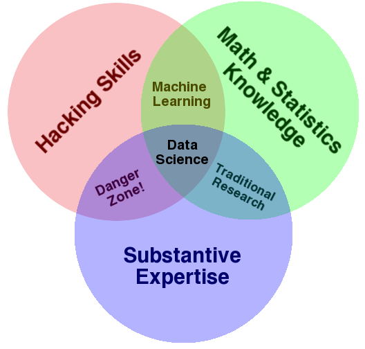
What is clear, however, is that one needs to learn a lot as they aspire to become a fully competent data scientist. Unfortunately, simply enumerating texts and tutorials does not untangle the knots. Therefore, in an effort to simplify the discussion, and add my own thoughts to what is already a crowded market of ideas, I present the Data Science Venn Diagram.


Data_Science_VD.png

How to read the Data Science Venn Diagram

The primary colors of data: hacking skills, math and stats knowledge, and substantive expertise

  • On Monday we spent a lot of time talking about "where" a course on data science might exist at a university. The conversation was largely rhetorical, as everyone was well aware of the inherent interdisciplinary nature of the these skills; but then, why have I highlighted these three? First, none is discipline specific, but more importantly, each of these skills are on their own very valuable, but when combined with only one other are at best simply not data science, or at worst downright dangerous.
  • For better or worse, data is a commodity traded electronically; therefore, in order to be in this market you need to speak hacker. This, however, does not require a background in computer science—in fact—many of the most impressive hackers I have met never took a single CS course. Being able to manipulate text files at the command-line, understanding vectorized operations, thinking algorithmically; these are the hacking skills that make for a successful data hacker.
  • Once you have acquired and cleaned the data, the next step is to actually extract insight from it. In order to do this, you need to apply appropriate math and statistics methods, which requires at least a baseline familiarity with these tools. This is not to say that a PhD in statistics in required to be a competent data scientist, but it does require knowing what an ordinary least squares regression is and how to interpret it.
  • In the third critical piece—substance—is where my thoughts on data science diverge from most of what has already been written on the topic. To me, data plus math and statistics only gets you machine learning, which is great if that is what you are interested in, but not if you are doing data science. Science is about discovery and building knowledge, which requires some motivating questions about the world and hypotheses that can be brought to data and tested with statistical methods. On the flip-side, substantive expertise plus math and statistics knowledge is where most traditional researcher falls. Doctoral level researchers spend most of their time acquiring expertise in these areas, but very little time learning about technology. Part of this is the culture of academia, which does not reward researchers for understanding technology. That said, I have met many young academics and graduate students that are eager to bucking that tradition.
  • Finally, a word on the hacking skills plus substantive expertise danger zone. This is where I place people who, "know enough to be dangerous," and is the most problematic area of the diagram. In this area people who are perfectly capable of extracting and structuring data, likely related to a field they know quite a bit about, and probably even know enough R to run a linear regression and report the coefficients; but they lack any understanding of what those coefficients mean. It is from this part of the diagram that the phrase "lies, damned lies, and statistics" emanates, because either through ignorance or malice this overlap of skills gives people the ability to create what appears to be a legitimate analysis without any understanding of how they got there or what they have created. Fortunately, it requires near willful ignorance to acquire hacking skills and substantive expertise without also learning some math and statistics along the way. As such, the danger zone is sparsely populated, however, it does not take many to produce a lot of damage.

I hope this brief illustration has provided some clarity into what data science is and what it takes to get there. By considering these questions at a high level it prevents the discussion from degrading into minutia, such as specific tools or platforms, which I think hurts the conversation.

I am sure I have overlooked many important things, but again the purpose was not to be speific. As always, I welcome any and all comments.

Cross-posed at dataists


The Data Science Venn Diagram is Creative Commons licensed as Attribution-NonCommercial.

Security Incidents and Voter Turnout in the 2009 Afghanistan Presidential Election

Note: Apologies for my recent lack of posts. As if often the case around this time of year, it takes some time to adjust to my new schedule and blogging tends to get pushed to the bottom of the stack. While I will continue to blog regularly, given the many projects I am involved in this Fall the frequency will very likely be lower than it has been over the past several months. Hopefully, however, the quality will be as good or better.

As many of you know, over the weekend Afghanistan held Parliamentary elections. In preparation for the election, noted observer of all things Afghanistan Joshua Foust wrote a column enumerating five key things to watch in the election. Number two was "There will be blood," asserting that these elections would be victim to large-scale Taliban attacks. As it turns out, however, by Afghan standard they were not particularly violent.

As Foust notes in a post-election follow up:

There were hundreds of election-related security incidents around Afghanistan on Saturday — just over 300, according to the defense minister. Across the country 63 polling stations were attacked with rockets, causing voters to run away from polling stations, and there was at least one suicide bomber. But that compares favorably to the 479 incidents of election violence during the 2009 presidential election. While it remains intolerable that so much violence mars the election, a 37% reduction in it is surely a good thing.

This is a curiosity, as Foust notes in his pre-election piece the Taliban were very explicit in their intentions to attack. Why, then, were so fewer attacks reported? One possible explanations is that fear is a much more cost-effective method for dissuading voters from voting than actual violence. That is, it is much easier to say you are going to attack people, hoping they will take you at your word, than it is to actually coordinate and execute an attack. Another, or perhaps related, reason is that such attacks are ineffective at affecting voter turnout.

To test this theory we could examine how the number of security incidents in each province of Afghanistan affected reported voter turnout in those provinces for the previous election. Fortunately, the Afghanistan Election Data project provides data on both the number of security incidents and voter turnout in the 2009 presidential election. By aggregating this data to the provincial level we can examine what—if any—relationship exists between the number security incidents and voter turnout in this case.

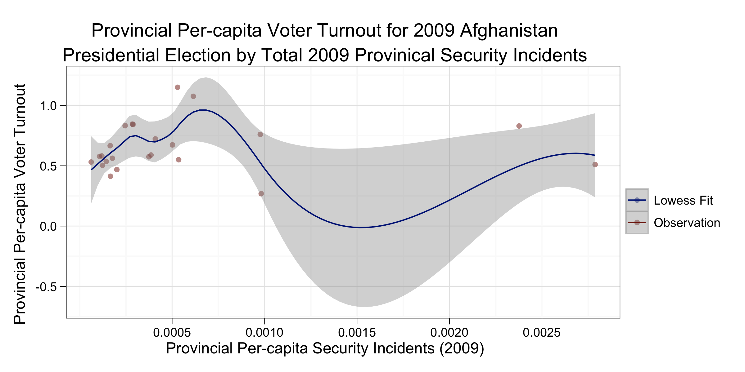
Below are two scatter plots that attempt to illustrate this. Both have provincial per-capita security incidents in 2009 on the x-axis and provincial per-capita voter turnout in the 2009 presidential election on the y-axis; the difference being the first plot uses a linear fit to estimate a relationship and the second uses a smoothed lowess.

Before proceeding, a brief note on the data. Both the security incidents and voter turnout data are provided at the district level, but 2009 population data is only provided at the provincial level. As such, I aggregated the data up in order to control for population levels in both voter turnout and security incidents. Also, security incident counts cover all of 2009, but the presidential election occurred in September of that year. As such, some number of the observations in this data set will have occurred after the elections; however, given that September is relatively late in the year most of the observation occur prior to the election.

prov_lm.png
prov_smooth.png

Interestingly, these plots show no discernible relationship between security incidents and voter turnout. The linear fit is basically flat, and the smoothed fit has multiple peaks and valleys. The level of aggregation needed to match all data points has reduced the level of observations to where statistical significance is difficult to test; however, these plots are an easy way to show the lack of relationship. The plots also clearly denote two outliers along the security incident dimension, these are the Farah and Kunarha provinces, and one worry may be that they are skewing the results. As can be observed in the plot below, wherein I have removed these observations, the lowess fit still shows no relationship.

smooth_noout.png

Are the Taliban updating their strategy based on observation from the 2009 election? These data provide some evidence that the number of security incidents have no effect on voter turnout, and if this is true then it makes sense that the Taliban would shift toward a strategy of deception and away from a tactical one.

Clearly, however, a more granular analysis is needed to extract more definitive conclusions from this data. I had hoped to do this using some of the spatial data included in the Afghanistan Election Data files, however, there appears to be a disconnect between the districts reported in the election data and the district contained in the Afghanistan district-level shapefiles. If anyone has expertise in how these mappings work please let me know, and if I can I will do another post with this analysis.

Supporting code available on Github